Wednesday 29 December 2010

Influences/ Inspiration

The Jam, The Clash, The Undertones, Sham 69, The Buzzcocks,
The Sex Pistols, The Who and Paul Wellar
All of these bands had a huge influence on their fans during the era. They each had an iconic image as well as a dstinctive voice to match. The success they had came with the help of having epic front men, such as The Clashes Joe Strummer, The Jams Paul Wellar and The Sex Pistols Sid Viscous.


The Clash- London Calling
Whether this image is seen with or without the writing, it is very iconic. London Calling was The Clashs 3rd album and recieved a brilliant reception. I was voted 2nd in the list of the Top 100 Albums of the 70s and appeared on Radio One's masterpieces in 2009.


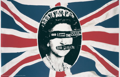
The Sex Pistols- God Save The Queen

Both the cover and song was controversial, due to the fact it was released during Queen Elizabeth II's Silver Jubilee. It was their 2nd single released. Due to the controversy surrounding the song meant that both the BBC and the Independent Broadcasting Authority opted against playing the song.

Monday 27 December 2010

Magazine Title

After having a long think about the name for my magazine, and sticking closely to the genre, I have come up with three possible ideas of the name my magazine could go by...

The first idea is 'Revival'. This stems from the idea that the magazine will be brining back the genre of punk and it's a revival. I would hope this would cause my audiences eye to be captured due to two factors on the page- the iconic and attention grabbing punk image, as well as the name. The name should then hopefully lead them to think that the magazine is a revival of punk music.


My second idea is 'Anarchy'. This idea came from the well known band The Sex Pistols track called Anarchy in the UK. I would hope that my target audience would recognise this because there isn't much else the work 'anarchy' assosiates with.


My third idea is to call my magazine 'Modist'. The word 'Modist' is not a mis spelling of 'modest' but in fact a play on words of being a MOD. I would have the 'MOD' part in bold and in capitals because you would immediately know what the magazine would be about. However, if I am to call it this I may need to change the theme to MOD's aswell as punk.

Useful Links

-Post Punk Tumblr This blog celebrates it's passion for the punk era. It consists of images, quotes, audio and videos; not only of bands from the 70's and 80's but also of bands today that aspire to be a punk band.

-Punk 77 I found this very useful site when I Googled 'punks'. It's a magazine, but is only on it's 16th issue, but the website for the magazine contains lots of useful information, it has: interviews with punks, the history of punk, lists of bands and much more!

-Punk Magazine This is a very old magazine which lasted between 1975 and 1979, as a fanzine. It covers many different bands from that era. It was revived in 2006, and issues are still being sold. I can look to this for inspiration.

Colour Pallets

-The three colours I would like to have has my magazine pallet are red, white and blue. I have chosen these colours because they are the colours of the union jack- a flag which was very popular during the punk era, as it was seen on many t-shirts and also the background to the infamous phrase 'Punks not dead'; this I hope would entice punk music lovers.
-I'm currently unsure on what shade of red I will be using. I don't want it to be too bright, because even though it will attract attention at the same time it could look quite 'cheap' and unproffesional.

-I think I'm going to use quite a dark shade of blue- this is because it's not quite black and shouldn't be mistaken for it, yet I've used a dark colour to tone down the brightness of the white and red.

-Blue has connotations of calm and relaxation, so I hope that this would mean it would be easy to look at for the reader. Red on the other hand has quite contrasting connotations; some people would assosiate it with love and passion, whereas others think of danger when they see it. Either way, I would hope that the red would bring some excitement to the reader.


Blue, white and red colour pallet


An example of clothing/ footwear that has the
design of the union jack on

Style of Magazine


After doing some research on my target audience, I have discovered that their favourite magazine is NME. Due to this, I will base the design of my idea on the magazine. 

Monday 20 December 2010

Audience Profile

My target audience involves two different types of people, yet they both have something in common- the love of punk music. I have decided to go for people of an older generation that grew up with punk music, followed by people of a younger age that still appreciate the music.

Ash, 47 is a hard working family man but can always make time to appreciate music. His favourite genre of music is punk music from the era of the 70's and 80's, with bands such as The Jam, The Buzzcocks, Sham 69 and The Clash. He lived his childhood listening to these bands, worshipping the likes of Joe Strummer and living the life of a punk with his fellow punk rockers and mods. He doesn't have a specific favourite shop because he doesn't pride himself on his apprearence as he believes he's already 'lived that part of his life'. Films thathe shares an interest in include The Italian Job, The Great Escape and Quadrophenia. As well as music, he has many other interests, some of them including: going to gigs, playing football and socialising. He has dislikes such as main stream pop music, badly played football and high technology. For a magazine Ash would spend around £3 maximum per issue. He believes he has reached all his goals but an ambition he still has is to provide for his family and still manage to keep a 'cool' image for a man of his age. He likes to buy music magazines that consist of 'real' bands with nothing of pop music inside.

Lucy is a 17 year old student studying A levels. She prides herself on her appearence and bases her look on the music she is passionate about. Her favourite genre of music is punk, and likes bands such as The Clash and The Sex Pistols, but also like MOD bands such as The Who. She finds herself wishing she was an '80's kid' because from this era she has a great interest in. She likes to wear these bands t-shirts to promote her love for them, and purchases most of her clothes from vintage boutiques. Some of her favourite films are similar to fellow target audience, as well as classic films such as Juno and Napoleon Dynamite. Other interests of hers include going to gig ands festivals, shopping, socialising with friends and keeping active. However, her dislikes involve: R & B and hip hop music, people who essentially 'boast' about their lifestyle and various others. She is willing to pay around £2.50 for a regular music magazine. An ambition in her life is to do well in school and later go on to have a successful careers- managing to sustain a passion for music.

The video below shows a good example of a classic punk band- you see an insight as to how they dressed, the type of music they played and the fans they had.

Basic Idea For My Magazine

At first I was unsure as to what genre of music my magazine would be based on. I didn't want to create your stereotypical 'Indie' magazine because many people create those, meaning mine wouldn't be very unique- which is something I want to pride myself on my magazine. To come up with an idea, I grouped together my interests of music which included 80's bands, punk music, as well as MOD. I thought these genres of music were quite different to the generation of today, so I have decided to give my magazine a punk theme and use the old bands from this era.

Moodboard


Magazine Logos
Each magazine logo I have looked at is very different. By having a unique logo as well as name, you give your magazine and distinguishable look, and it'll be recognisable and stand out when on shop shelves. All the logos seem quite bold sold I'm going to add this idea when I'm creating my logo and magazine name; when it comes to the name I need to make it simple to say but rememerable as that's what most music magazines appear to do, e.g. NME or Clash.

Magazine Covers
The moodbaord conatins various magazine covers, but all have a certain look that makes them recognisable. However, all have a very similar layout- this consists of the magazine logo or name being in the top, left hand corner (left aligned). I think I'll use this idea because it's very conventional and it should make it appear more professional.

Inspirational Bands
The image put on the front is very important, it's best to make the artist/s appear iconic- making the issue more memorable. The majority of the images used are close up or mid shot, although a few long shots are used. If there is just one artist they appear very strong and 'fierce', whereas a band tends to show unity.

Colour Pallet
A variety of colour pallets have been used, but all go together very well. I have noticed that by using an 'expensive' colour like gold on your front cover gives the magazine a more classy appeal and sophistication. Whereas a colour like purple is used to capture your eye because it's not a common colour used on magazines. The majority of magazines stick to the colours red, white and black- I think these are good, professional colours to use, but it wont make your magazine stand out because it's similar to the rest.

Front Cover
The front cover must have a simple yet effective layout. This is done by being consitant and putting the logo/ magazine name, barcode and image in the same place. Meanwhile, the puffs can be located anywhere inyeresting on the page and use features to make them stand out; doing this will attract other readers that aren't necessarily a fan of the artist/s on the front.

Contents
The contents is similar to the front in the sense of having all the features in the same place. The title 'Contents' wll be located at the left- usual left aligned. However, most magazines vary in where the contents list is placed. NME for example has a band index on the left and the contents on the right, whereas Q Magazine places theirs on the left hand side.

Double Page Spread
If consistancy is shown on the front cover and contents, it must be followed through onto the double page spread, although there is less pressure to get it exact. It is best to stick to the same body font, meanwhile when adding the images, a different colour pallet can be used. This will seperate the page from the rest, therefore the reader will be more interest in reading it.

Tuesday 14 December 2010

Analysing Mixmag Magazine (Front Cover)


Background
-It was first launched in 1982, but the first issue was printed a year later.
-It's a British dance and clubbing magazine.
-The editor is Dave Seaman, who is also a DJ.
-It was originally a newsletter for DJ's but then turned into a magazine that covers dance events, reviews music and club nights.
-Between 2008 and 2009, the magazine had a circulation of 26,000.
-The magazine has also released a number of CD's that went by the name of 'Mixmag Live'.

Front Cover
-After looking at various issues of the magazine I can see that they don't stick to a colour scheme. However, the do stick to using bright colours. The colour pallet on this front cover is white, pink and black- all quite contrasting colours.
-By using a white background on the front cover your eyes are immediately drawn to the bright pink used for the masthead and puffs.
-The bright colours are also added to by having the model wearing a pink and blue that are quite metallic so it would capture your eye when on a magazine stand. Due to them using a long shot you also gain more colours.
-By having headphones and DJing equipment as props, the idea of it being a dance magazine is reinforced.
-The bar code has been placed in the bottom right hand corner which is the usual positioning.
-The blonde haired, skinny model carrying a small dog is someones stereotypical idea of a famous female, and the good body shape is essentially what the public want to see.
-There is a number of other DJ's listed at the bottom right, and images at the top right, which will attract the readers because they want to know about their idols/ stars.
-"HUGE XMAS & NYE PARTY GUIDE" is in a pink bubble which stands out more than the rest of the text, and will attract it's target market, because you associate dance music with young people and students, who will be interested in parties.
-Having the "I" different to the rest of the font gives it a distinguished look and recognisable if your saw it in a store.

Analysing NME Magazine (Contents and Double Page Spread)

Thursday 9 December 2010

Analysing NME Magazine (Front Cover)


Background
-The magazine was first published in March 1952.
-On 14th November 1952, it was the first British magazine to include a singles chart.
-During 1972 to 1976 is was associated with 'gonzo journalism'- which means the reporter is usually part of the story. It later went on to be associated with punk rock because of writer Tony Parsons and Julie Burchill.
-The magazines first female editor took over in July 2009, her name is Krissi Murison.
-It started off as a non-glossy tabloid but has now progressed to having full, glossy, colour covers.
The magazines circulation has started to fall since 2003. During the second half of 2009, the magazine's circulation was 38,486.
Each week the magazine goes on sale at £2.20.

Front Cover
-The image used, which is also the back ground of the page is black and white. This is probably due to the content of the image- having John Lennon on the front is quite a vintage image so the black and white reinforces this. As well as the fact that having such a huge star on the front means there's no need for bright colour, because the audience should already be attracted.
-The other colours used a red, white and grey- all which go well with a black and white colour scheme, and keeps it subtle.
-John Lennon is also seen smoking a cigarette in the image. This has connotations of rebellion, which could attract teenagers to read the magazine.
-The masthead is usually a bright, eye catching red, however this time they've used a grey. This is due to the image and wanting the audience to focus on the image as the eye catching part, but still being able to see "NME".
-Unlike other magazines, the barcode is in the bottom left hand corner this time.
-Similarly to Q Magazine, "30th ANNIVERSARY SPECIAL" also offers a sense of exclusivity to the reader. It gives them the idea that only NME magazine is doing a special on John Lennon.
-Another similarity is they list other bands on the front cover that are featured in the issue- as said previously, this will help attract people who are interested in other genres of music.
-The repetition of "His" implies that the content in the story will be very trustworthy and will all be from what he has said. This should effectively bring the reader closer to their 'idol' perhaps, instead of reading a writers opinion of him.

Analysing Q Magazine (Contents and Double Page Spread)

Tuesday 7 December 2010

Analysing Q Magazine (Front Cover)


Background
-The first issue of Q magazine was made in 1986.
-The magazine is owned by Bauer who also have owenership of magazines such as TV Choice and Take A Break.
-The editor of Q magazine is Paul Reese, who was formally the editor of Kerrang magazine.
-It was orginally called 'Cue', but changed it's name because people confused the magazine with being a snooker one. As well as the 'Q' being more distinctive. It is also a house style.
-Each issue goes on sale at the beginning of every month for £3.99.
-The circulation of the magazine in 2007 was recorded at 130,179 copies.
-It has gained some critisism due to that fact that it creates a lot of 'top' lists, instead of writing articles about musicians- causing it to be acuused 'lazy'.

Front Cover
-The colour pallet used on the front page is red, white, black and gold. Using red, white and black is a very recognisable technique of Q magazine. It gives it a clean image as well as exclusivity and looking professional.
-Using "THE WORLD EXCLUSIVE" on the front at the top is definately a technique used to boast exclusivity.
-Having the bands title as the largest font on the page immediately catches the audiences eye because it's dominant.
-"Back for good?" is a good use of play on words/ pun because it's a song title of the band that also relates to the article. The question is also an enigma, questionning the audience.
-The barcode can be found near the bottom right hand corner, where it can be found on most magazines.
-The image used of the band is clearly showing togetherness and unity. The fact that they are all smiling and wearing similar leather jackets also shows that they are unified.
-Puffs on the page are all other bands. Each of them which are categorized in a very different genre. These were probably put on to draw in audience that wouldn't necessarily like Take That. Having "Green Day" in huge bold capital letters was a good choice, because there are a completely differently listen when compared to Take That, so the magazing can show diversity on it's front page.

Basic Magazine Research

-Some examples of music magazines that are on sale today are Kerrang, Q, NME, Mojo, Smash Hits, Rolling Stone, Mix Mag, BBC Music Magazine and Clash.
-The catergories these magazines could come under include: rock, indie, main stream, pop, jazz and classical.
-You can find that they are usually priced between £2.00 and £4.50.
-The magazines will usually go on sale weekly or monthly.
-They can be sold in various places such as: supermarkets, your local store or corner shop, or a garage.